The open question: what belongs on the windshield, and where does it become overhead?
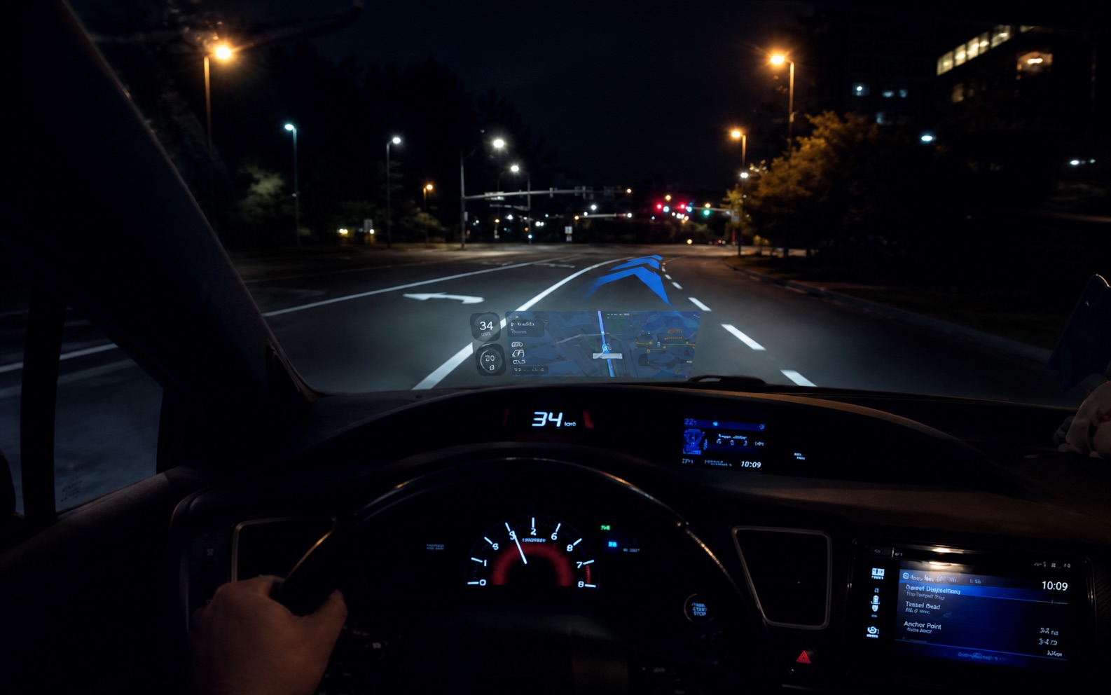
AR navigation is compelling because it puts directions where drivers are already looking. The harder product question is what to show, when to remove it, and how to evaluate whether it reduces workload or creates it.
Dashboard screens and phone maps create a secondary task: glance down, interpret, look back up, decide if the timing still applies. That attentional gap is where errors concentrate.
The project centered on DrivAR, a windshield-based AR HUD. The unresolved question was whether it could reduce navigation uncertainty without becoming another interface to manage at speed.
We had a working AR concept but no criteria for what guidance belonged on the windshield, how to prioritize it visually, or how to evaluate whether it helped beyond stated preference.
Define which cues deserved product priority, how they should sit in the visual hierarchy, and what evidence would separate useful guidance from attention cost.
In driving, a useful cue and a distracting one can look identical until something goes wrong.
The product risk was overdesign. At a highway exit, the decision window is small. An overlay that asks drivers to parse too much doesn’t just distract. It consumes the window.
AR can reduce glance-switching cost or increase cognitive load, depending on what it asks drivers to parse. The right direction was the HUD that made the next driving decision faster, not the most capable one.
Drivers were already naming where existing tools failed:
- 12 / 12
- used Google Maps as their primary navigation tool
- 11 / 12
- reported lane confusion as a navigation pain point
- 10 / 12
- missed turns due to unclear instructions
We moved from attitudes to behavior to product tradeoffs.
Each phase narrowed the next decision: clean up the survey, size the problem, observe behavior, then test product tradeoffs.
-
01
Cognitive interview (survey pretesting), n=2.
Two pre-distribution cognitive interviews surfaced interpretation gaps. We revised Likert scales, tightened questions, and cut wording that blurred AR curiosity from actual navigation need.
-
02
Exploratory survey, n=15 fielded, n=12 complete responses summarized.
Established baselines on navigation frequency, route stress, AR familiarity, and distraction concerns. Sized the problem and identified the target population for follow-up.
-
03
Semi-structured interviews, n=8.
Uncovered where drivers lose confidence: late prompts, reroutes that conflicted with decisions already in motion, instructions that were accurate but spatially wrong. Those failure moments defined what the HUD had to solve.
-
04
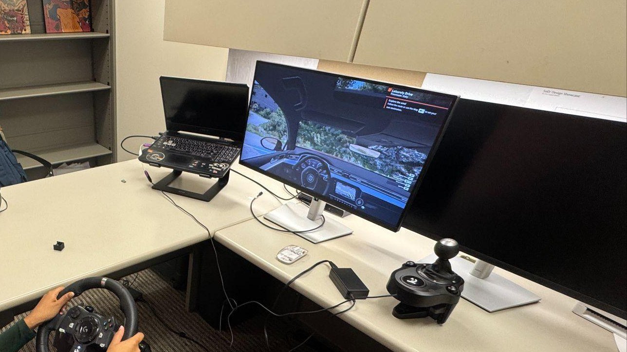
Simulator sessions, n=5.
BeamNG simulator with Wizard-of-Oz AR overlays. Observed route decisions, hesitation, detours, and map-checking under controlled conditions. Two tasks: static map, then AR overlays.
-
05
Concept evaluation, n=10.
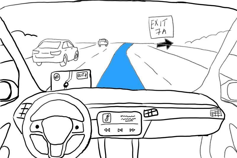
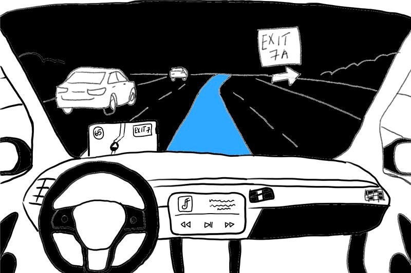
Two HUD directions: persistent windshield content versus sparse guidance. The question was not which looked better but which produced higher confidence and lower perceived risk while driving.
The evidence shifted the question from more AR to less interpretation.
None of the five participants completed the static-map route. All five completed the AR overlay route. Because the AR task came second, I treated it as directional, not conclusive. The question became: which cues reduce interpretation cost, and which add it?
-
01
Navigation pain was tied to timing and confidence, not missing features.
Missed turns from late prompts, lane uncertainty at exits, stress from conflicting cues. AR had value when it resolved second-guessing before the decision point. Its failure mode was adding visual complexity at the exact moment the driver needed clarity.
-
02
The evaluation standard was set by tools drivers already rely on.
Participants benchmarked the concept against Google Maps, Apple Maps, and CarPlay. That defined the product standard: the HUD did not need to be more capable than those tools. It needed to be faster to read under load.
-
03
The simulator produced a stark finding, then a nuance that mattered more than the headline.
Task completion split 0/5 to 5/5. Task time was noisier, so I looked at recovery actions instead: the static-map task produced 13 detours, 64 map checks, and 7 moderator requests. With AR overlays, all three dropped to zero.
-
04
The feature set converged to four things across the research sequence.
Lane guidance, turn arrows, speed limits, and rare hazard alerts appeared consistently across phases. Persistent overlays, fuel levels, messages, and non-driving content were out of scope.
Simulator Evidence
Task time was noisy. Recovery actions dropped to zero.
Detours, map checks, and moderator requests are recovery actions. Task time varied. Whether they happened at all was the clearer signal.
Decision signal: zero detours, zero map checks, zero moderator map requests. That became the product bar. Measure workload and confidence, not task time alone.
Design the HUD as a sparse decision layer, not a second dashboard.
The research produced a constraint, not a feature list. Earn windshield space by reducing cognitive effort at the decision point. Anything that doesn't serve that is subordinate or gone.
-
01
Lane and turn guidance come first.
Lane choice, turns, exits, and route changes belong on the windshield. Other information competes with them.
-
02
Secondary information stays quiet.
Speed and arrival context belong lower in the visual hierarchy. They should not compete with primary guidance cues.
-
03
Hazard alerts are for behavior changes only.
Only show a hazard alert if it changes what the driver does. Frequent alerts train drivers to ignore the system. Standard: rare, specific, timely enough to act on.
-
04
Keep the windshield focused on the road.
Voice and automation fit the driving context. Touch, gesture, messages, and productivity content do not. Any feature expanding this boundary needs separate justification.
-
05
Evaluate by workload, not polish.
The next study should measure confidence, glance frequency, hesitation, detours, task errors, and perceived distraction. Preferring a HUD and safely using one are different outcomes.
Decision Impact
Before the research: AR on a windshield was an open concept. After: a constrained product direction and a behavioral evaluation standard for the next prototype.
Lane guidance, turns, speed, and rare hazard alerts earned windshield space. The next prototype is evaluated by workload and confidence, not demo appeal.
It shifted the product question. The bar for AR on a windshield isn’t capability. It’s whether it reduces interpretation cost at the moment the driver needs to decide.
Lane and turn guidance at the top of the hierarchy. Speed and hazard cues secondary. Persistent overlays, map clutter, and non-driving content removed entirely.
Fewer detours, less hesitation, lower perceived workload, higher confidence. Preference ratings alone are not sufficient evidence. A driver can prefer a HUD and still be distracted by it.
The strongest research output was a constraint.
Novelty and utility are different questions.
AR impresses in prototypes. The productive test is whether it reduces interpretation cost under real conditions. Keeping that distinction front of mind kept the team from optimizing for demo appeal.
Behavioral measures need harder conditions in the next study.
The simulator captured route decisions and recovery actions. It didn’t capture performance under real pressure. Gaze tracking, NASA-TLX, and route complexity variation belong in the next study. The completion gap was a strong signal, not enough to ship on.
What I would test next.
Both simulator routes were low-complexity. The next study should add route complexity and gaze tracking to find where AR guidance stops reducing interpretation and starts adding to it.